> ## Documentation Index
> Fetch the complete documentation index at: https://flatfile.com/docs/llms.txt
> Use this file to discover all available pages before exploring further.
# Theming
> Learn how to customize the look and feel of Flatfile to match your brand
Flatfile supports modifying most UI elements including colors, fonts, borders, padding, and more via the [Space](/core-concepts/spaces) endpoint.
1. Start by simply updating `theme.root.primaryColor` and `theme.sidebar.logo` when calling `spaces.update()`.
2. If needed, you can customize the theme further with additional css variables.
## Building a theme
Learn how to create a Space with a theme, and update a theme from an Event listener.
```javascript theme={null}
import api from "@flatfile/api";
export default function flatfileEventListener(listener) {
//listen for space:configure job and build out space
listener.filter({ job: "space:configure" }, (configure) => {});
//theme during creation or update your space after it is created
listener.on("space:created", async ({ context: { spaceId } }) => {
const updateSpace = await api.spaces.update(spaceId, {
metadata: {
theme: {
root: {
primaryColor: "red",
},
sidebar: {
logo: "https://image.png",
},
// See reference for all possible variables
},
},
});
});
}
```
See full code example in our [flatfile-docs-kitchen-sink Github repo](https://github.com/FlatFilers/flatfile-docs-kitchen-sink/blob/main)
## Theme reference
### theme.root
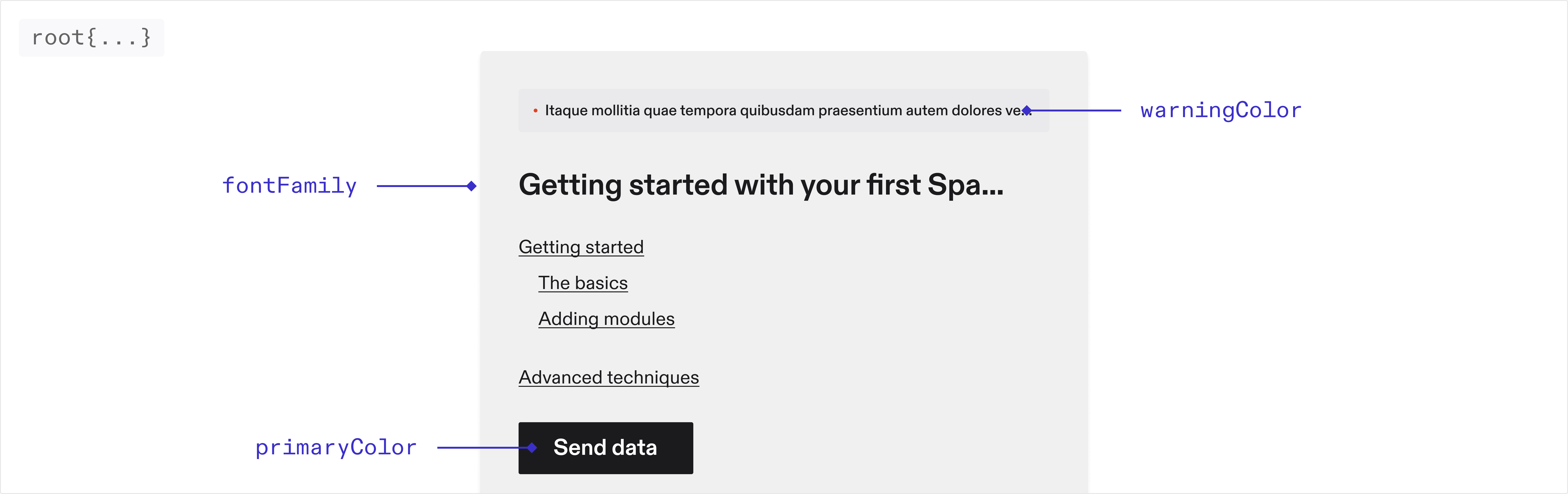 The sidebar, table and document will automatically inherit theming from your
root variables!
#### Font
**fontFamily** `string`\
The font family used throughout the application. Only system fonts are supported at the moment
#### Colors
**primaryColor** `string`\
The primary color used throughout the application.
**dangerColor** `string`\
The color used for error messages.
**warningColor** `string`\
The color used for warning messages.
**borderColor** `string`\
The color used for borders throughout the application.
### theme.sidebar
The sidebar, table and document will automatically inherit theming from your
root variables!
#### Font
**fontFamily** `string`\
The font family used throughout the application. Only system fonts are supported at the moment
#### Colors
**primaryColor** `string`\
The primary color used throughout the application.
**dangerColor** `string`\
The color used for error messages.
**warningColor** `string`\
The color used for warning messages.
**borderColor** `string`\
The color used for borders throughout the application.
### theme.sidebar
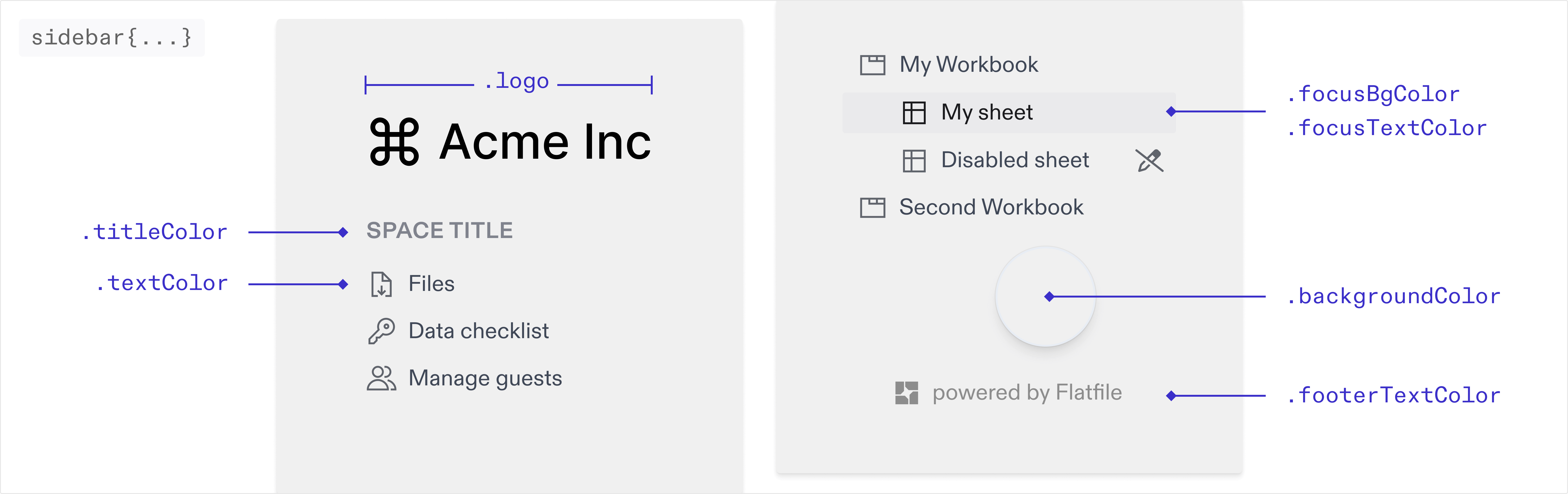 You can override the default colors of the sidebar below. If these are not set
they will inherit from your root colors.
**logo** `string`\
The img path for the logo displayed in the sidebar.
**textColor** `string`\
The color of the text in the sidebar.
**titleColor** `string`\
The color of the title in the sidebar.
**focusBgColor** `string`\
The background color of the active navigation link. The hover state will use the same color with 30% opacity applied.
**focusTextColor** `string`\
The text color of the active/focused navigation link.
**backgroundColor** `string`\
The background color of the sidebar.
### theme.table
You can override the default colors of the sidebar below. If these are not set
they will inherit from your root colors.
**logo** `string`\
The img path for the logo displayed in the sidebar.
**textColor** `string`\
The color of the text in the sidebar.
**titleColor** `string`\
The color of the title in the sidebar.
**focusBgColor** `string`\
The background color of the active navigation link. The hover state will use the same color with 30% opacity applied.
**focusTextColor** `string`\
The text color of the active/focused navigation link.
**backgroundColor** `string`\
The background color of the sidebar.
### theme.table
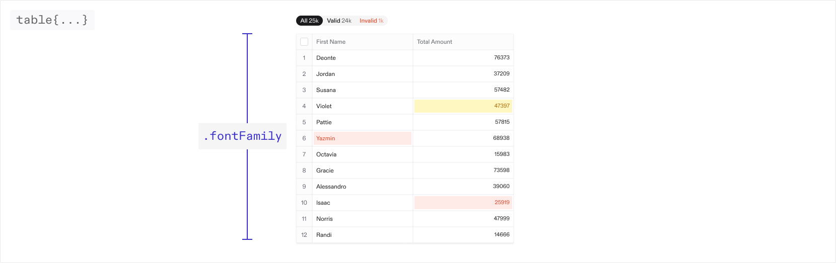 You can override the default colors and values for different elements in the
table below. If these are not set they will inherit from your root values.
#### Font
**fontFamily** `string`\
The font family used throughout the table. Only system fonts are supported at the moment
#### Active cell
**cell.active.borderWidth** `string`\
The width of the border around the active cell.
**cell.active.borderShadow** `string`\
The box shadow around the active cell.
**cell.number.fontFamily** `string`\
The font family for number cells.
#### Column header
You can override the default colors and values for different elements in the
table below. If these are not set they will inherit from your root values.
#### Font
**fontFamily** `string`\
The font family used throughout the table. Only system fonts are supported at the moment
#### Active cell
**cell.active.borderWidth** `string`\
The width of the border around the active cell.
**cell.active.borderShadow** `string`\
The box shadow around the active cell.
**cell.number.fontFamily** `string`\
The font family for number cells.
#### Column header
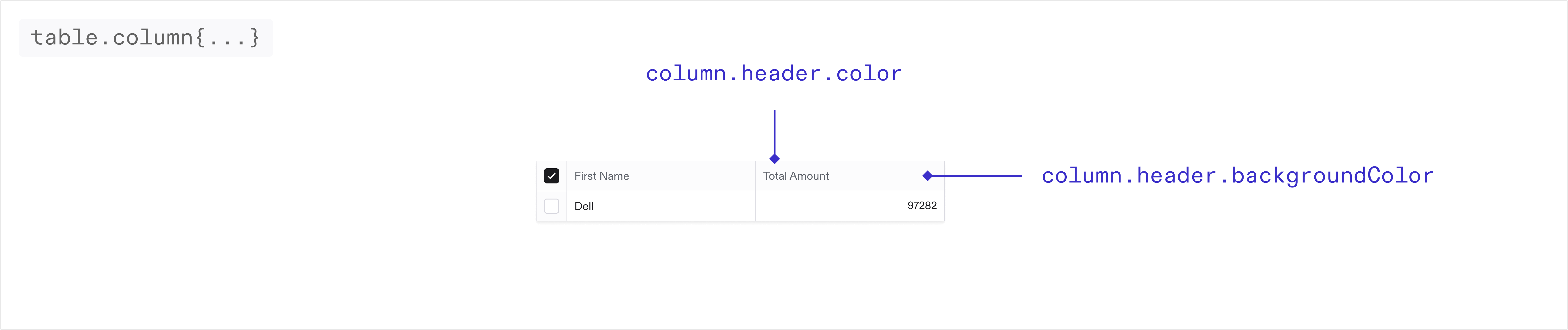 **column.header.backgroundColor** `string`\
The background color of the column headers in the table.
**column.header.color** `string`\
The text color of the column headers in the table.
#### Index column
**column.header.backgroundColor** `string`\
The background color of the column headers in the table.
**column.header.color** `string`\
The text color of the column headers in the table.
#### Index column
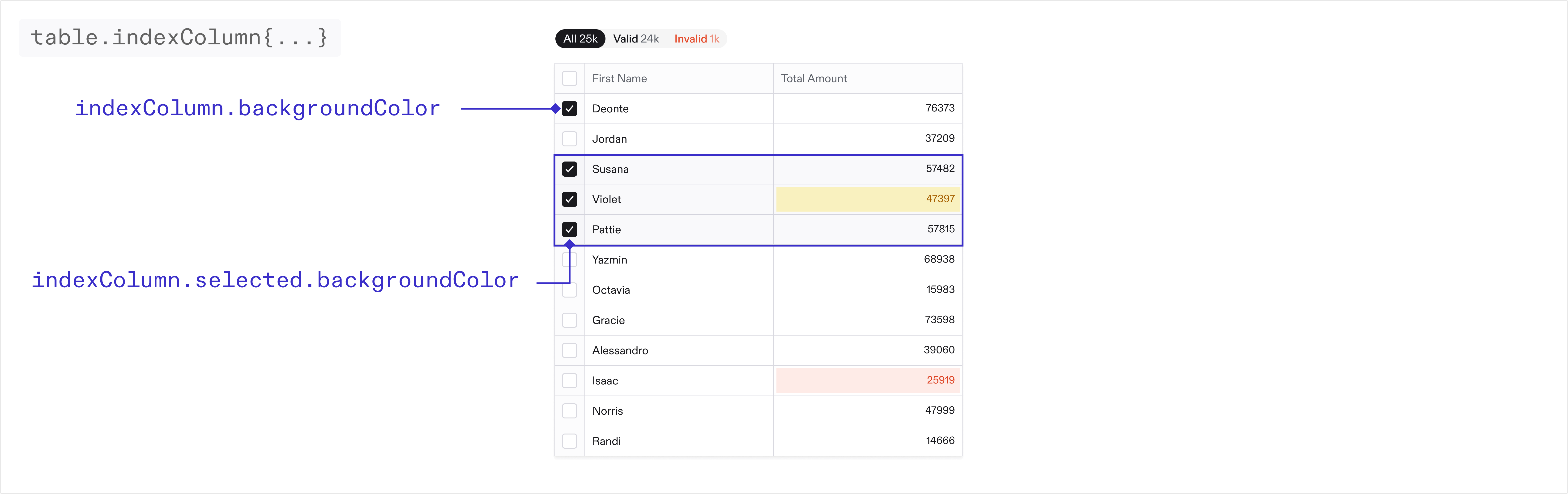 **indexColumn.backgroundColor** `string`\
The background color of the first column in the table.
**indexColumn.color** `string`\
The text color of the first column in the table.
**indexColumn.selected.backgroundColor** `string`\
The background color of the first column in the table when selected.
#### Checkboxes
**indexColumn.backgroundColor** `string`\
The background color of the first column in the table.
**indexColumn.color** `string`\
The text color of the first column in the table.
**indexColumn.selected.backgroundColor** `string`\
The background color of the first column in the table when selected.
#### Checkboxes
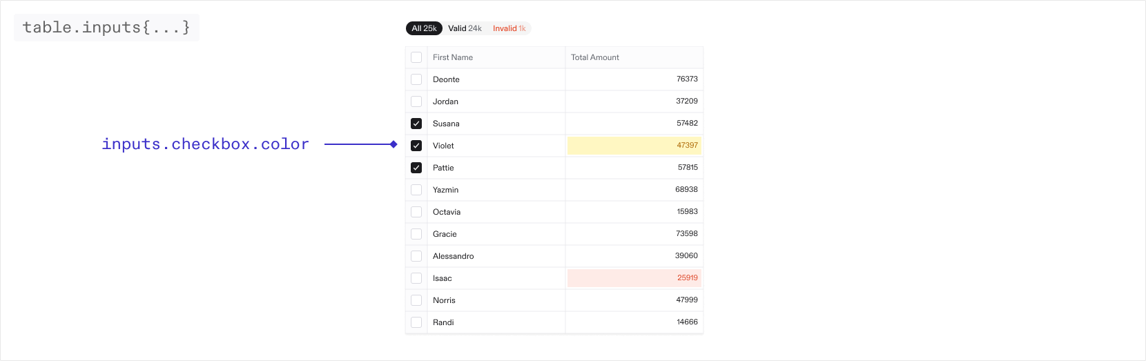 **inputs.checkbox.color** `string`\
The color of the checkboxes in the table.
**inputs.checkbox.borderColor** `string`\
The color of the border for the checkboxes in the table.
#### Filters
**filters.outerBorderRadius** `string`\
The border radius of the table filters
**filters.innerBorderRadius** `string`\
The border radius for the individual filters
**filters.outerBorder** `string`\
The border of the table filters. By default there is no border.
> When nested objects share the same border radius, small gaps may appear. To resolve this, adjust the inner and outer border radius on the filters to seamlessly fill any gaps.
#### Buttons
**buttons.iconColor** `string`\
The color of the icon buttons in the toolbar and table
**buttons.pill.color** `string`\
The color of the pill buttons in the toolbar
### theme.email
You can theme the guest invite emails as well as guest email verification emails via the properties below. These are sent to a guest when they are invited to a Space via the guest management page in your Space.
> Email theming is only available on the pro and enterprise plans.
**logo** `string`\
The URL of the image displayed at the top of the email
**textColor** `string`\
The color of the text in the email
**titleColor** `string`\
The color of the title in the email
**buttonBgColor** `string`\
The background color of the button
**buttonTextColor** `string`\
The text color of the button
**footerTextColor** `string`\
The text color of the footer text
**backgroundColor** `string`\
The background color of the email
#### theme.email.dark
If your default email theme (as set above) is light, we suggest adding a dark mode email theme. Different email providers handle dark and light mode differently. While Apple Mail and some other clients will respect dark mode variables, some email providers do not support dark mode and will display your default theme. We suggest you test your themes across various email clients before going to production to ensure consistent appearance.
**logo** `string`\
The URL of the image displayed at the top of the email in dark mode
**textColor** `string`\
The color of the text in the email in dark mode
**titleColor** `string`\
The color of the title in the email in dark mode
**buttonBgColor** `string`\
The background color of the button in dark mode
**buttonTextColor** `string`\
The text color of the button in dark mode
**footerTextColor** `string`\
The text color of the footer text in dark mode
**backgroundColor** `string`\
The background color of the email in dark mode
## Deprecation Notice
Flatfile's new design system released in Q1 2025 supports a more streamlined experience when configuring theme. The new system accepts a more limited set of properties, but ensures those supplied properties are cohesively applied across the application.
As a result, many of the original `theme.root` properties which applied to specific UI elements have been deprecated. We have taken steps to ensure some level of backwards compatibility for these properties in the new system - however we recommend any usage of these properties be updated to the new system as soon as possible.
## Example Project
Find the theming example in the Flatfile GitHub repository.
* [Clone the theming example in Typescript](https://github.com/FlatFilers/flatfile-docs-kitchen-sink/blob/main/typescript/theming/index.ts)
* [Clone the theming example in Javascript](https://github.com/FlatFilers/flatfile-docs-kitchen-sink/blob/main/javascript/theming/index.js)
**inputs.checkbox.color** `string`\
The color of the checkboxes in the table.
**inputs.checkbox.borderColor** `string`\
The color of the border for the checkboxes in the table.
#### Filters
**filters.outerBorderRadius** `string`\
The border radius of the table filters
**filters.innerBorderRadius** `string`\
The border radius for the individual filters
**filters.outerBorder** `string`\
The border of the table filters. By default there is no border.
> When nested objects share the same border radius, small gaps may appear. To resolve this, adjust the inner and outer border radius on the filters to seamlessly fill any gaps.
#### Buttons
**buttons.iconColor** `string`\
The color of the icon buttons in the toolbar and table
**buttons.pill.color** `string`\
The color of the pill buttons in the toolbar
### theme.email
You can theme the guest invite emails as well as guest email verification emails via the properties below. These are sent to a guest when they are invited to a Space via the guest management page in your Space.
> Email theming is only available on the pro and enterprise plans.
**logo** `string`\
The URL of the image displayed at the top of the email
**textColor** `string`\
The color of the text in the email
**titleColor** `string`\
The color of the title in the email
**buttonBgColor** `string`\
The background color of the button
**buttonTextColor** `string`\
The text color of the button
**footerTextColor** `string`\
The text color of the footer text
**backgroundColor** `string`\
The background color of the email
#### theme.email.dark
If your default email theme (as set above) is light, we suggest adding a dark mode email theme. Different email providers handle dark and light mode differently. While Apple Mail and some other clients will respect dark mode variables, some email providers do not support dark mode and will display your default theme. We suggest you test your themes across various email clients before going to production to ensure consistent appearance.
**logo** `string`\
The URL of the image displayed at the top of the email in dark mode
**textColor** `string`\
The color of the text in the email in dark mode
**titleColor** `string`\
The color of the title in the email in dark mode
**buttonBgColor** `string`\
The background color of the button in dark mode
**buttonTextColor** `string`\
The text color of the button in dark mode
**footerTextColor** `string`\
The text color of the footer text in dark mode
**backgroundColor** `string`\
The background color of the email in dark mode
## Deprecation Notice
Flatfile's new design system released in Q1 2025 supports a more streamlined experience when configuring theme. The new system accepts a more limited set of properties, but ensures those supplied properties are cohesively applied across the application.
As a result, many of the original `theme.root` properties which applied to specific UI elements have been deprecated. We have taken steps to ensure some level of backwards compatibility for these properties in the new system - however we recommend any usage of these properties be updated to the new system as soon as possible.
## Example Project
Find the theming example in the Flatfile GitHub repository.
* [Clone the theming example in Typescript](https://github.com/FlatFilers/flatfile-docs-kitchen-sink/blob/main/typescript/theming/index.ts)
* [Clone the theming example in Javascript](https://github.com/FlatFilers/flatfile-docs-kitchen-sink/blob/main/javascript/theming/index.js)